Fyle
User Research
Usability Testing
Visual Design
UX Design
Personal Cards
How we re-designed the 'Personal Cards' feature on Fyle to enable users to easily submit work expenses while reducing manual effort.
business context
simplifying expense filing
Fyle aims to streamline the process of filing and managing company employee expenses by reducing manual efforts. We noticed that around 70% of our users rely on corporate cards due to the perception of better control over employee spending. Unfortunately, the existing Personal Cards feature hadn't gained the expected traction, prompting us to investigate the reasons behind its low usage.
To enhance user experience and flexibility, we wanted to empower employees by allowing them to integrate any card with Fyle. This powerful function would automatically sync all expense data to Fyle, eliminating the need for manual entry and simplifying the entire expense filing process. By doing so, we expected to provide a more user-friendly and efficient solution to our users.
Addressing User Barriers
The low usage of the Personal Cards feature can be attributed to several key reasons:
Mobile App Unavailability: With approximately 85% of users relying on the mobile app for expense submissions, the lack of the Personal Cards feature on the app posed a significant hindrance to adoption.
Limited Use Case Consideration: The feature's complexity and lack of essential functionalities, such as the inability to delete added cards, resulted in an accumulation of unused cards on Fyle, creating user frustration.
user research
uncovering user's pain points
In the user research phase, we focused on understanding the "Spender" segment, comprising 73.7% of our user base. These are company employees who utilize Fyle to submit expenses and claim reimbursements.
To gain insights into their expense filing experience, we conducted interviews with 5 users and reviewed past interview recordings. Our research aimed to answer the following questions:
How do users incorporate expense filing into their daily routines?
Where and how do they typically file expenses?
What challenges do they encounter during the process?
Are they using Fyle's Personal Cards feature, and if so, what difficulties do they face with it?
Through these interviews, we gained valuable insights into user behaviours and expectations, providing a foundation for improving the Spender's overall experience.
I travel a lot for work. I wish expense filing was easier on the go.
I keep a separte card just for work expenses so that I can easily file expenses at the end of the month. I suggest my employees to do the same.
Scanning a long list of transactions on Fyle at the end of every month to look for work expenses is a tedious task.
One of the cards I added to Fyle last year has expired and I don’t use it anymore. I don’t know how to remove it.
I don’t want to spend time filing expenses. I have to manually enter the expense details and submit them to get reimbursements.
🧑🏻💻 My Job
As a salesperson, I frequently travel for work and cover expenses using cards or cash. Upon returning to the office, I submit my expenses with receipts to the finance department monthly, waiting for reimbursement.
💭 My Expectations
I want to easily and quickly submit my expenses so that I can get my reimbursements as soon as possible.
😤 My Frustrations
Manually submitting expense details like date, amount, and merchant is time-consuming and tedious. Additionally, digging up receipts for reference adds to the hassle.


Dave
opportunities
how could the experience be improved?
With the help of the information I got from the user interviews and data analysis, I identified opportunities to improve the experience and achieve our goal of providing visibility of company spending to our users.
✈️
Help users file
expenses on the go
The first part of the process would be to cater to mobile app users whihch could drastically improve usage.
🔎
Make sorting
transactions easier
Users had trouble going through long lists of transactions. Therefore, looking for specific work transactions needed to be made simpler.
📝
Help users to
file expenses faster
Users want to spend the least amount of time filing expenses. We needed to simplify the user flow to reduce the time spent in doing so.
wireframing
simplifying add card functionality
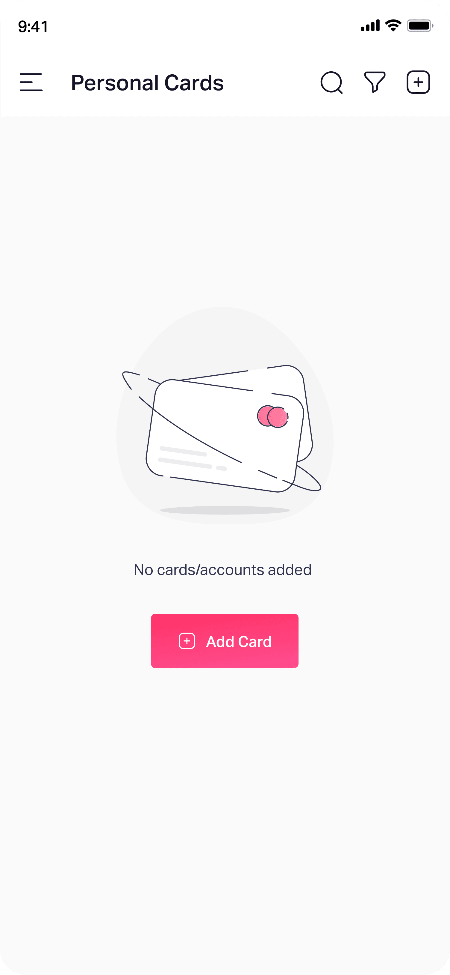
In this phase, we analysed user data and noticed that the majority of users only added 1 card, with the maximum being 6 due to the inability to remove existing cards. Based on this insight, we de-prioritized the add card button and moved it to the nav bar, assuming most users would only have 1-3 cards.
During the HFD (High-Fidelity Design) stage, we further explored options to facilitate easy card switching and establish a clear correlation between cards and their transactions.
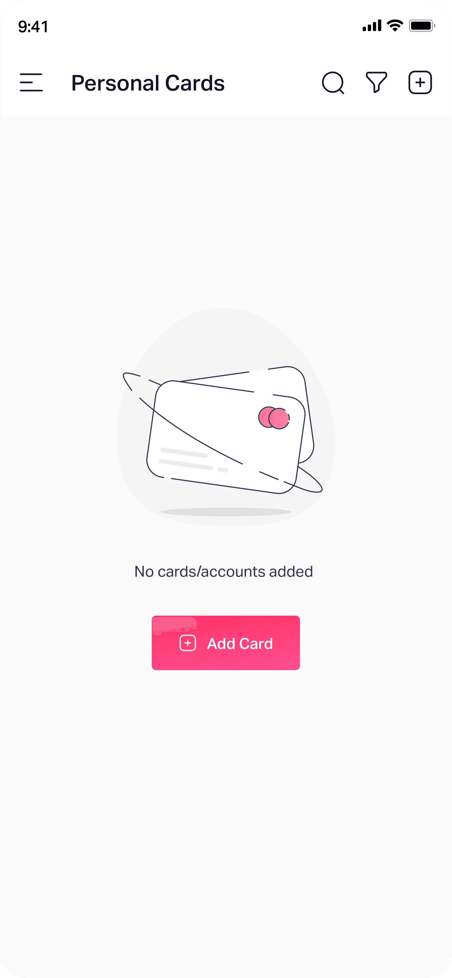
Personal Cards
Bank of America ****2345
Filter
Add Card
Personal Cards
Bank of America ****2345
Credit Card
Last Synced: XX XX XXX
Add Card
Filter
Personal Cards
Bank of America ****2345
Bank of America ****2345
Credit Card
Credit Card
Last Synced: XX XX XXX
Last Synced: XX XX XXX
Filter
Add new cards/
accounts from here.
Automating Transaction Sync
The team engaged in extensive discussions regarding the "Sync Transactions" Call-to-Action (CTA) on Fyle. While some members favored a manual approach to offer users a sense of control, others believed it was unnecessary.
Since users had already linked their cards to Fyle, automating the transaction sync was proposed to provide them with real-time expense data, eliminating the need for manual clicks.
Personal Cards
Bank of America ****2345
Bank of America ****2345
Credit Card
Credit Card
Last Synced: XX XX XXX
Last Synced: XX XX XXX
Filter
Sync Transactions
Personal Cards
Bank of America ****2345
Bank of America ****2345
Credit Card
Credit Card
Last Synced: XX XX XXX
Last Synced: XX XX XXX
Filter
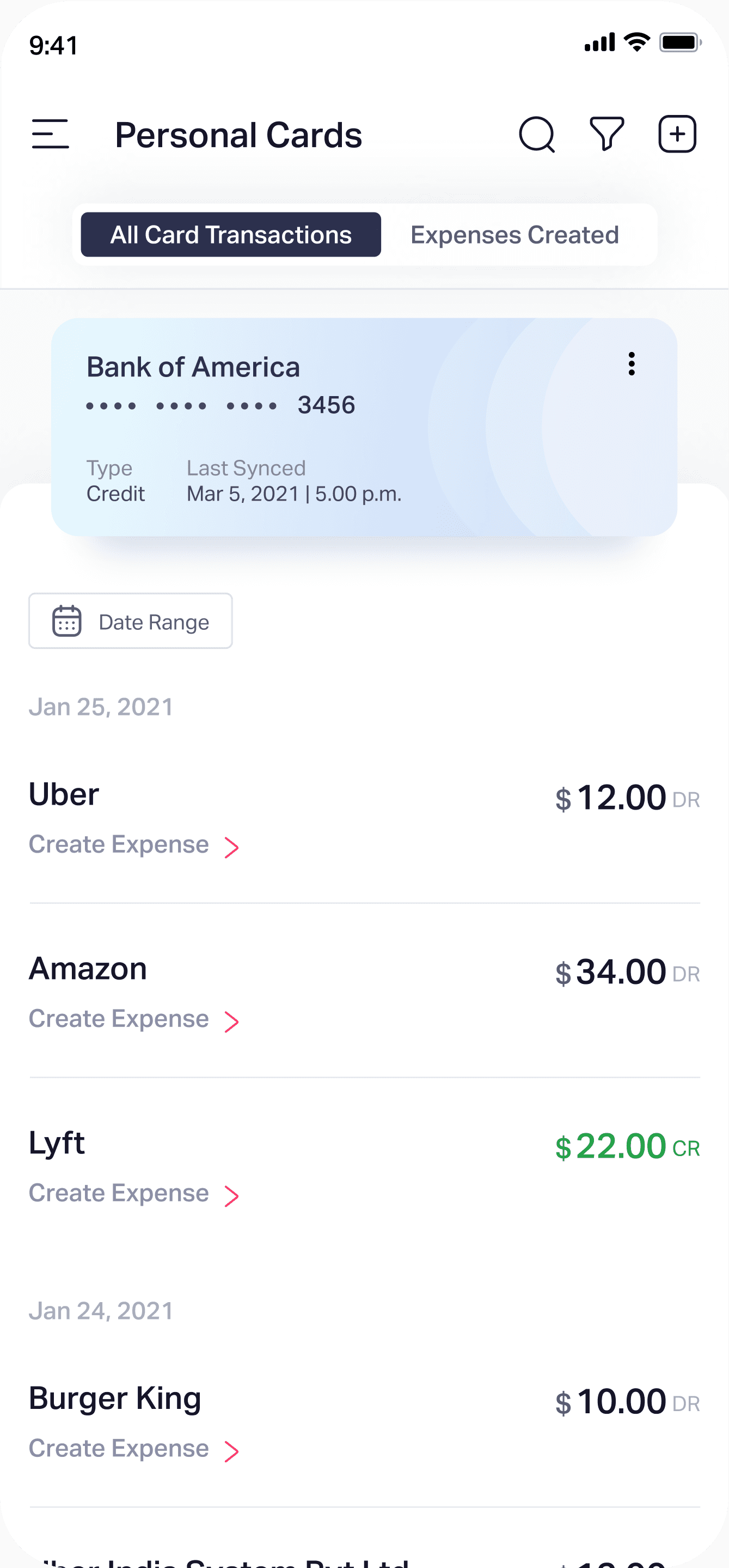
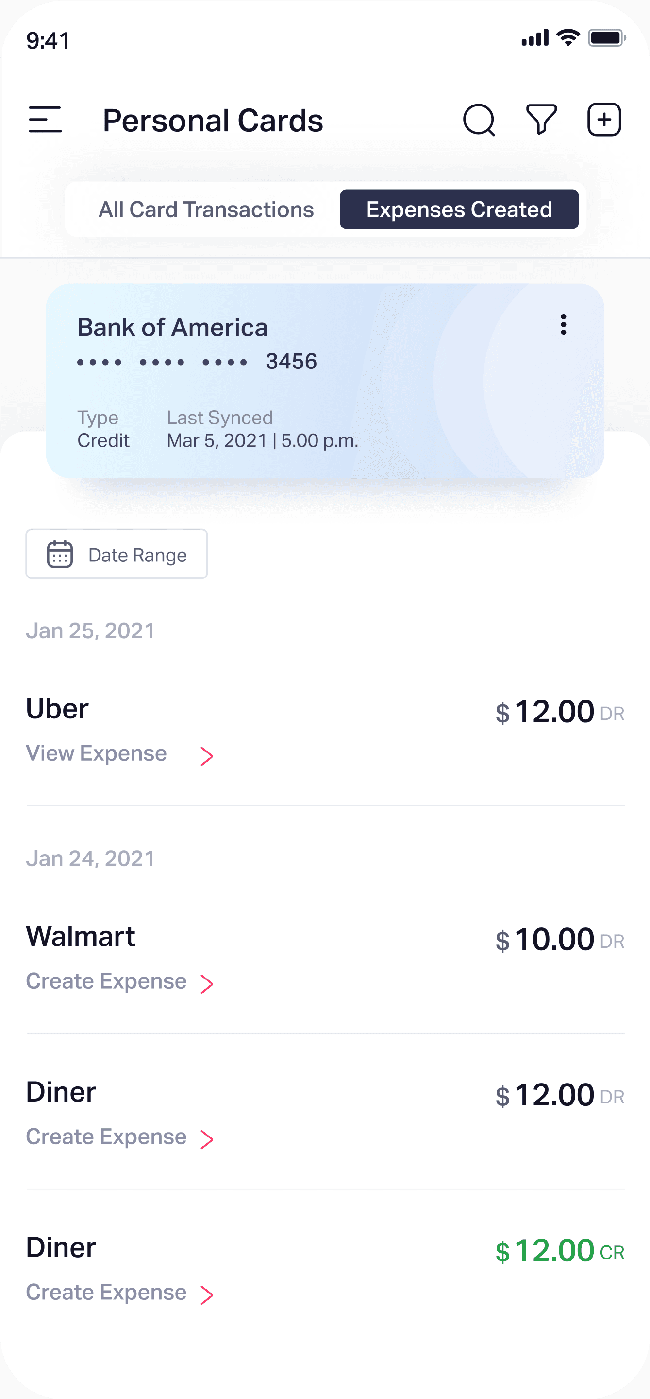
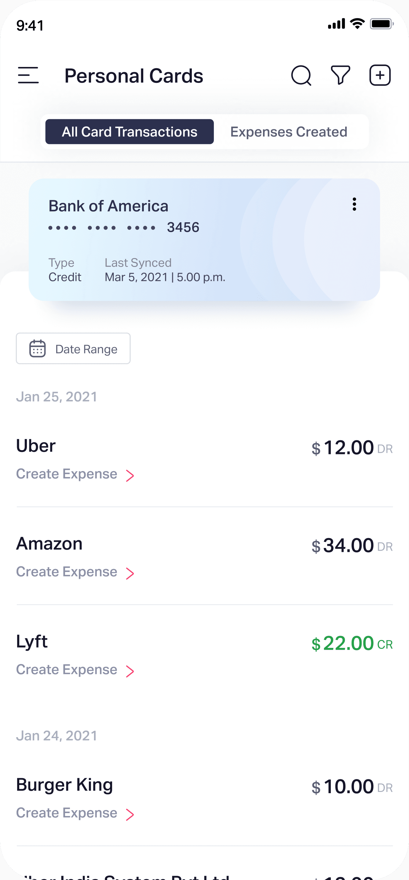
Creating expenses from trancations
Since these were users own cards it was highly probable that a majority of the tranactions coming in would be personal trancations. The limited data we had showed that only 24% of the trancation were work expenses. So, our initial idea was to let users decide which tranactions they want to create expenses from. The difference between the two being tranactions were not editable, while expenses were editable and could more information about th expense (such as receipt, category, project etc.). Basically it was how we stored data in the back-end and then presented it to our users.
However, we soon realised that this was not the best experience once we started testing its usability.
Personal Cards
Create Expense
Create Expense
Create Expense
Create Expense
Create Expense
Create Expense
Create Expense
Bank of America ****2345
Bank of America ****2345
Credit Card
Credit Card
Last Synced: XX XX XXX
Last Synced: XX XX XXX
Filter
All transactions
Expenses Created
Personal Cards
Create Expense
Create Expense
Create Expense
Create Expense
Create Expense
Create Expense
Create Expense
Bank of America ****2345
Bank of America ****2345
Credit Card
Credit Card
Last Synced: XX XX XXX
Last Synced: XX XX XXX
Filter
All transactions
Expenses Created
Save Expense
Cancel
Create Expense
Personal Cards
Bank of America ****2345
Bank of America ****2345
Credit Card
Credit Card
Last Synced: XX XX XXX
Last Synced: XX XX XXX
Filter
All transactions
Expenses Created
usability Testing
What went wrong?
Once the wireframes and HFDs were ready, I conducted testing with 5 user to highlight any major flaws in the experience.
I noticed some very interesting behaviour from the users:
1. When asked how would they go about filing expenses from the app, the users immidiately assumed that they will be able to select multiple tranactions from the list and then add it to a report.
2. This made me realise that the users did not have the distinction in their minds between transactions and expenses. Their natural expecation was that everythig they see in the list is an expense.
3. I also realised that the end journey of the expense is to be submiited for reimbursement. Simply creating an expense does not make the user reach their goal. The experinece should support a start-to-finish joueny, where users can submit expense reports usinng their card expenses with ease.
9:41
Create Expense
Currency
*
USD
Payment Mode
*
Paid by me
Spend Date
*
Jan 25, 2021
Amount
*
12.00
Category
*
Travel
Select project
Billable
Enter purpose
Merchant
Uber
Cost center
Select cost center
Group
Select tax group
Tax
00.00
Add to report
Select a report
Fill all the required fields before splitting an expense.
Hide more fields
Split Expense
Cancel
Save Expense
Introducing Personal Cards
Easily switch between cards
If users have multiple cards, they can easily witch between them by swiping the cards. This gives them a clear relation between the expenses and the cards instantly.
Each card has a different colour to make it easier for them to recognize them without reading the card number or bank name.
Dave Matthews
Name
Credit
Type
Wells Fargo
6456
Dave Matthews
Name
Credit
Type
Chase
4676
Dave Matthews
Name
Credit
Type
Bank of America
3452
Expense submission made easy
It was clear during the user testing that the entire expense submission process had to be rethought.
I removed the extra step of creating an expense and treating all transactions as expenses, since that is how the users view them. They can select multiple expenses at a time and directly add them to a report and submit it. This makes the whole process a lot more quicker and seamless. Users do not have to visit multiple parts of the app and can complete the entire submission journey in one single flow.
Filters, Search & Dates
As i found during user interviews that looking for specific expenses from a long list was a pain-point for the users. To solve the probelm, we introduced a number of filters along with a date filter and the ability to search for any specific expense.
9:41
Create Expense
Currency
*
USD
Payment Mode
*
Paid by me
Spend Date
*
Jan 25, 2021
Amount
*
12.00
Category
*
Travel
Select project
Billable
Enter purpose
Merchant
Uber
Cost center
Select cost center
Group
Select tax group
Tax
00.00
Add to report
Select a report
Fill all the required fields before splitting an expense.
Hide more fields
Split Expense
Cancel
Save Expense
Expense States, deleting a card & Home page visibility
Once the expense is added to a report, a status pill appears on the expense so that the spenders get visibility of which expenses have been submitted or not just by looking at the list. It was alos important to show if any mandatory information or receipts were missing from an expense added to a report and so users need visibility of that too to complete the expenses.
Deleteing cards was a long requestd addtion to the personal cards feature, and so I added the delete functionality to the card UI.
If users are using cards to file expenses then they need visibility of ccards and their expenses on the hope page as well to provide easy access.

9:41
Create Expense
Currency
*
USD
Payment Mode
*
Paid by me
Spend Date
*
Jan 25, 2021
Amount
*
12.00
Category
*
Travel
Select project
Billable
Enter purpose
Merchant
Uber
Cost center
Select cost center
Group
Select tax group
Tax
00.00
Add to report
Select a report
Fill all the required fields before splitting an expense.
Hide more fields
Split Expense
Cancel
Save Expense
Add any card to Fyle
We partnered with Yodlee to aenable users to add any card or account to Fyle easily.
Once added, all their expenses automatically sync with Fyle. This provides them with real-time visibility of all their spending.
Edit expense to add receipts and other information
Some orgs require additional information to be added along with receipts to all or some expenses.
Users can simply click on any expense to open and add this information.
Impact
Onec the new designs were released, we saw a significant improvement in usage in short period of time.
The usage of the feature increased by 62% whithn 3 months.
Total number of cards connected increased by 36%.
67% of users only connected 1 card/account. Only 4% of users connected more that 3 cards.